CSS を使用した画像のスタイル方法を学習します。
丸みを帯びた画像を作成するには、border-radius プロパティを使用します:
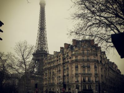
サムネイル画像を作成するには、border プロパティを使用します。
サムネイル画像:
img {
border: 1px solid #ddd;
border-radius: 4px;
padding: 5px;
}
<img src="paris.jpg"
alt="Paris">
Try it Yourself ❯
リンク付きのサムネイル画像:
a {
display: inline-block;
border: 1px solid #ddd;
border-radius: 4px;
padding: 5px;
transition: 0.3s;
}
a:hover {
box-shadow: 0
0 2px 1px rgba
(0, 140, 186, 0.5);
}
<a href="paris.jpg">
<img src="paris.jpg" alt="Paris">
</a>
Try it Yourself ❯
レスポンシブ画像は、画面サイズに合わせて自動的に調整されます。
ブラウザウィンドウのサイズを変えて、効果を確認してください:

画像サイズを小さくしたければ小さくし、大きくしたければ大きくした場合は、次のコードを追加します:
チップ: レスポンシブ Web デザインについては、CSS RWD チュートリアル をご覧ください。
画像をページの中央に配置するには、margin: auto; を使用し、ブロック要素に画像を設置します:
画像内にテキストを配置する方法:
Try it Yourself:
Top Left ❯ Top Right ❯ Bottom Left ❯ Bottom Right ❯ Centered ❯
Troll's tongue in Hardanger, Norway

Northern Lights in Norway
div.polaroid {
width: 80%;
background-color: white;
box-shadow: 0 4px 8px 0 rgba(0,
0, 0, 0.2), 0 6px 20px 0 rgba(0, 0, 0, 0.19);
}
img {width: 100%}
div.container {
text-align: center;
padding: 10px 20px;
}
Try it Yourself ❯
CSS filter プロパティは、要素に(ぼかしや彩度など)視覚効果を加えます。
注: filter プロパティは、Internet Explorer、Edge 12、または Safari 5.1 以前のバージョンではサポートされません。
黒と白(100%灰色)のすべての画像の色を変更します:
img {
-webkit-filter: grayscale(100%); /* Chrome, Safari, Opera */
filter: grayscale(100%);
}
チップ: CSSフィルタの詳細については、CSS フィルタ・リファレンス を ご覧ください。
CSSは、イメージ・ギャラリーの作成に使用することができます。この例では、さまざまな画面サイズに画像を再配置するために、 メディアクエリを使用します。効果を確認するために、ブラウザウィンドウのサイズを変更してください:


.responsive {
padding: 0 6px;
float: left;
width: 24.99999%;
}
@media only screen and
(max-width: 700px){
.responsive {
width: 49.99999%;
margin: 6px
0;
}
}
@media only screen and (max-width: 500px){
.responsive {
width: 100%;
}
}
Try it Yourself ❯
チップ: レスポンシブ Web デザインの詳細については、CSS RWD チュートリアルをご覧ください。
これは、CSS と JavaScript を一緒に動作させる方法を実証するための一例です。
まず、CSS を使いモーダル・ウィンドウ(ダイアログボックス)を作成し、それをデフォルトで非表示にします。
次に、ユーザが画像をクリックしたときに、JavaScript を使いモーダルウィンドウを表示すると共に、モーダル内に画像を表示します:
// Get the modal
var modal = document.getElementById('myModal');
// Get the image and insert it
inside the modal - use its "alt" text as a caption
var img =
document.getElementById('myImg');
var modalImg = document.getElementById("img01");
var captionText = document.getElementById("caption");
img.onclick =
function(){
modal.style.display = "block";
modalImg.src = this.src;
modalImg.alt = this.alt;
captionText.innerHTML = this.alt;
}
// Get the <span> element that closes the modal
var span =
document.getElementsByClassName("close")[0];
// When the user clicks
on <span> (x), close the modal
span.onclick = function() {
modal.style.display = "none";
}
Try it Yourself ❯