CSS と JavaScript を使用したレスポンシブなモーダル画像を作成する方法を学習します。
モーダルは、現在のページの上に表示されるダイアログ・ボックス/ポップアップ・ウィンドウです。
この例では、前章のモーダル・ボックスのほとんどのコードを使用していますが、 この例では画像を使用します。
<!-- Trigger the Modal -->
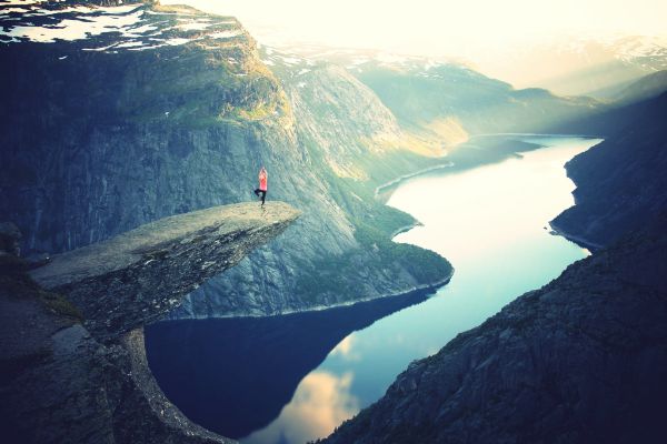
<img id="myImg" src="img_fjords.jpg"
alt="Trolltunga, Norway" width="300" height="200">
<!-- The Modal
-->
<div id="myModal"
class="modal">
<!-- The Close Button -->
<span class="close" onclick="document.getElementById('myModal').style.display='none'">×</span>
<!-- Modal Content (The Image) -->
<img class="modal-content" id="img01">
<!-- Modal
Caption (Image Text) -->
<div id="caption"></div>
</div>
/* Style the Image Used to Trigger the Modal */
#myImg {
border-radius: 5px;
cursor: pointer;
transition: 0.3s;
}
#myImg:hover {opacity: 0.7;}
/* The Modal (background) */
.modal {
display: none; /* Hidden by default */
position: fixed; /* Stay in place */
z-index: 1; /*
Sit on top */
padding-top: 100px; /* Location of the
box */
left: 0;
top: 0;
width: 100%; /* Full width */
height: 100%; /* Full
height */
overflow: auto; /* Enable scroll if needed
*/
background-color: rgb(0,0,0); /* Fallback color */
background-color: rgba(0,0,0,0.9); /* Black w/ opacity */
}
/*
Modal Content (Image) */
.modal-content {
margin:
auto;
display: block;
width:
80%;
max-width: 700px;
}
/* Caption of Modal
Image (Image Text) - Same Width as the Image */
#caption {
margin: auto;
display: block;
width: 80%;
max-width: 700px;
text-align: center;
color: #ccc;
padding: 10px 0;
height: 150px;
}
/* Add Animation - Zoom in the Modal */
.modal-content, #caption {
-webkit-animation-name: zoom;
-webkit-animation-duration:
0.6s;
animation-name: zoom;
animation-duration: 0.6s;
}
@-webkit-keyframes
zoom {
from {-webkit-transform:scale(0)}
to {-webkit-transform:scale(1)}
}
@keyframes zoom {
from {transform:scale(0)}
to {transform:scale(1)}
}
/* The Close Button */
.close {
position:
absolute;
top: 15px;
right:
35px;
color: #f1f1f1;
font-size:
40px;
font-weight: bold;
transition: 0.3s;
}
.close:hover,
.close:focus {
color: #bbb;
text-decoration: none;
cursor: pointer;
}
/* 100% Image Width
on Smaller Screens */
@media only screen and (max-width: 700px){
.modal-content {
width: 100%;
}
}
// Get the modal
var modal = document.getElementById('myModal');
// Get the image and insert it inside the modal - use its "alt" text as a
caption
var img = document.getElementById('myImg');
var modalImg =
document.getElementById("img01");
var captionText =
document.getElementById("caption");
img.onclick = function(){
modal.style.display = "block";
modalImg.src = this.src;
captionText.innerHTML =
this.alt;
}
// Get the <span>
element that closes the modal
var span = document.getElementsByClassName("close")[0];
// When the user clicks on <span> (x), close the modal
span.onclick =
function() {
modal.style.display = "none";
}
Try it Yourself »