
Top Left
Top Right
Bottom Left
Bottom Right
Top Mid
Middle
Bottom Mid
w3-display-container クラスは、要素を別な要素の中に配置できるようにします。
指定の高さの <div> 要素内にコンテンツを配置します:
<div class="w3-display-container w3-green" style="height:300px;">
<div class="w3-display-topleft">Top Left</div>
<div class="w3-display-topright">Top Right</div>
<div class="w3-display-bottomleft">Bottom Left</div>
<div class="w3-display-bottomright">Bottom Right</div>
<div class="w3-display-middle">Middle</div>
<div class="w3-display-topmiddle">Top Mid</div>
<div class="w3-display-bottommiddle">Bottom Mid</div>
</div>
Try It Yourself ❯
上の例にパディングを追加:
<div class="w3-display-container w3-green" style="height:300px;">
<div class="w3-padding w3-display-topleft">Top Left</div>
<div class="w3-padding w3-display-topright">Top Right</div>
<div class="w3-padding w3-display-bottomleft">Bottom Left</div>
<div class="w3-padding w3-display-bottomright">Bottom Right</div>
<div class="w3-padding w3-display-middle">Middle</div>
<div class="w3-padding w3-display-topmiddle">Top Mid</div>
<div class="w3-padding w3-display-bottommiddle">Bottom Mid</div>
</div>
Try It Yourself ❯
画像内にテキスト表示:
<div class="w3-display-container">
<img src="img_lights.jpg" alt="Lights" style="width:100%">
<div class="w3-padding w3-display-topleft">Top Left</div>
<div class="w3-padding w3-display-topright">Top Right</div>
<div class="w3-padding w3-display-bottomleft">Bottom Left</div>
<div class="w3-padding w3-display-bottomright">Bottom Right</div>
<div class="w3-padding w3-display-topmiddle">Top Mid</div>
<div class="w3-padding w3-display-middle">Middle</div>
<div class="w3-padding w3-display-bottommiddle">Bottom Mid</div>
</div>
Try It Yourself ❯
<div class="w3-red w3-display-container w3-card-8" style="height:200px;width:350px">
<div class="w3-red w3-display-topleft" style="width:25%;height:40%"></div>
<div class="w3-red w3-display-topright" style="width:60%;height:40%"></div>
<div class="w3-red w3-display-bottomleft" style="width:25%;height:40%"></div>
<div class="w3-red w3-display-bottomright" style="width:60%;height:40%"></div>
</div>
Try It Yourself ❯
w3-round-size クラスは、要素に角丸のボーダーを追加します:
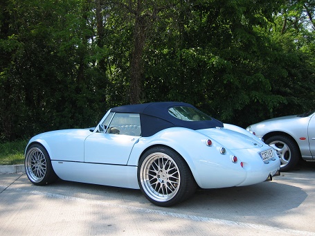
w3-center class centers an element.
<div class="w3-container w3-center">
<h2>Centered Content</h2>
<img src="img_car.jpg" alt="car" style="width:80%;max-width:320px">
<p>The w3-center class centers an element.</p>
</div>
Try It Yourself ❯
w3-align-left および w3-align-right クラスは、テキストの配置に使用します。
Left aligned text.
Right aligned text.
<div class="w3-container w3-border w3-large">
<div
class="w3-left-align"><p>Left aligned text.</p></div>
<div
class="w3-right-align"><p>Right aligned text.</p></div>
</div>
Try It Yourself ❯
w3-left クラスは、要素を左にフロートし、w3-right クラスは、 要素を右にフロートします:
<div class="w3-container w3-light-grey">
<div class="w3-left
w3-red">w3-left</div>
<div class="w3-right w3-blue">w3-right</div>
</div>
Try It Yourself ❯
w3-show または w3-hide クラスは、強制的に要素を表示したり非表示にします。
<p class="w3-show">I am shown (display: block).</p>
<p class="w3-hide">I am hidden
(display: none).</p>
Try It Yourself ❯
このクラスは、要素の表示・非表示をトグルするために使用します: