角丸:

円形:
ボーダー付き:

テキスト:

Nature
角丸:
円形:
ボーダー付き:
テキスト:

w3-round class adds rounded corners to an image:
w3-circle class shapes an image to a circle:
w3-border class adds borders around the image:
カードのように (そして影を) 表示するために、<img> 要素の周りを w3-card-* クラスでラップします:
boss of all bosses
画像が、自動的にコンテナのサイズに合うように自分自身のサイズを変更するように設定することができます。
しなければならないことの全ては、画像幅を 100% に設定することです:
<div class="w3-container">
<img src="img_lights.jpg"
alt="Lights" style="width:100%">
</div>
Try It Yourself ❯
レスポンシブ画像を最大サイズに制限したい場合は、max-width プロパティを使用します:
<div class="w3-container">
<img src="img_lights.jpg"
alt="Lights" style="width:100%;max-width:400px">
</div>
Try It Yourself ❯
画像へテキストを配置するには、w3-display-classes を使用します:
Top Left
Top Right
Bottom Left
Bottom Right
画像の上部または下部に中央揃えのテキストを配置することもできます:
<div class="w3-display-container">
<img src="img_lights.jpg"
alt="Lights">
<div class="w3-display-topleft w3-container">Top
Left</div>
<div class="w3-display-topright w3-container">Top
Right</div>
<div class="w3-display-bottomleft w3-container">Bottom
Left</div>
<div class="w3-display-bottomright w3-container">Bottom
Right</div>
<div class="w3-display-middle w3-large">Middle</div>
</div>
Try It Yourself ❯
w3-hover-opacity クラスは、マウスオーバーすると画像に透明度を追加します:
w3-opacity クラスは、画像を透明にします:
Normal
With class="w3-opacity"
デフォルトの不透明度は 0.6 です。これは、0 ~ 1 の値に変更できます:
Opacity 0.2
class="w3-opacity"
Opacity 0.8
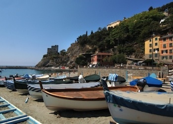
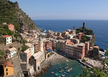
この例では、すべてのデバイス上で見映えの良いフォトアルバムを作成するため、W3.CSS レスポンシブ・グリッド・システムを使用しています。 これについては、後段で詳細を学習します。
<div class="w3-third">
<div class="w3-card-2">
<img src="img_monterosso.jpg" style="width:100%">
<div
class="w3-container">
<h4>Monterosso</h4>
</div>
</div>
</div>
Try It Yourself ❯