毎年、新しい web 技術や動向が見られます。
このページでは、あなたに最も関連性の高い Web デザインのトレンドを動向します。
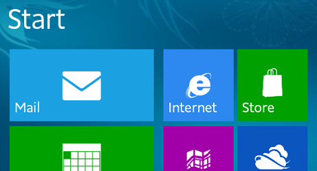
フラットデザインの傾向は、2010 年の Windows Phone 7 と Windows 8 から始まりました:
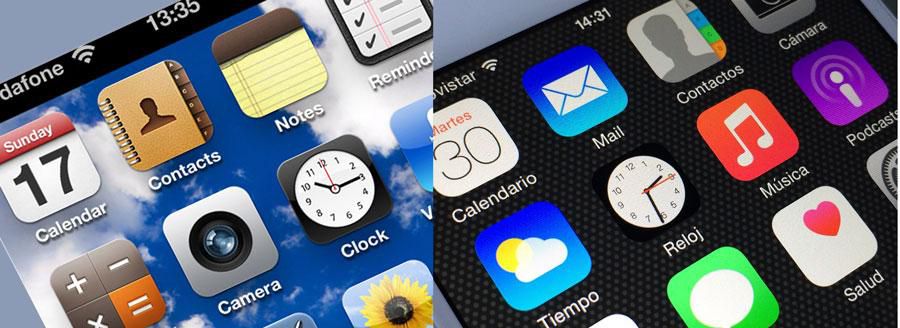
それに、2013年の iOS 7 でアップルが追随しました:
フラットデザインは、多くの場合、マーケティング、道路標識、付箋から知られている色を使用しています:
Red
Green
Blue
Yellow
フラット・デザインがもたらす大きな問題の一つは、どのエリアがクリックできるかを見極めることです。
そもそも、イメージとクリック可能なボタンとの違いは何でしょうか?
ほぼフラット(Almost flat)は、元のフラットデザインに代る新たな選択肢です。
ほぼフラットは、より多くの深さ、より明るい色、より複雑な影、およびサイズを兼ね備えています。
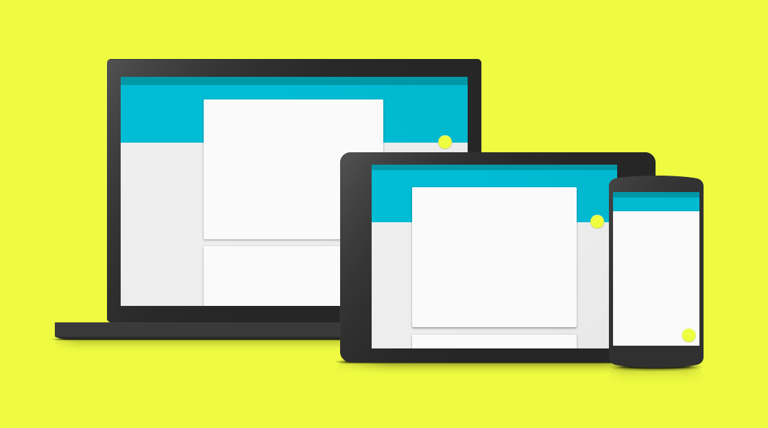
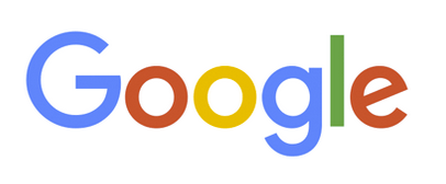
フラット・デザインは(ほぼフラットとともに)ピークに達した可能性があるため、 多くのデザイナーが、マテリアル・デザイン(2014年に Google が設計した)に向かうことが期待されています。
マテリアル・デザインは、紙とインクを思い出させてくれる要素を使用します。更に、 要素は、リアルな影とホバー効果をもっています:
カードは、今日、web の至る所ににあります。
最も代表的なカードは、画像に多少のテキストを持つ矩形です。
カードは、同じ平面上に見出し、画像、テキストを整理するための一般的な構造となっています。
カードは、大きくも小さくもできると共に、写真の有り無しや、影の有り無しにすることもできます:
Architect and engineer
1 new friend request
CEO at Mighty Schools. Marketing and Advertising. Seeking a new job and new opportunities.
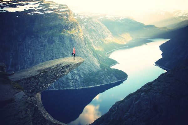
Troll's tongue in Hardanger, Norway
Cleaner ロゴは、フラット・デザインの人気の成果です:
読み易い。分かり易い。設計が簡単。
ミニマリズムは、ほぼフラット(Almost flat)デザインと連携することができます:
Minimalism is a principle that can help people with focus in their lives.
Design minimalism can help simplify and improve designs as well.
フラットデザインの自然なタイポグラフィは、シンプルで読みやすくなっています。
文字間隔と行間隔は、一般的に大きくなっています。
読者の注意をより多く集中させるために、フォントサイズを大きくすることも求められます。
Simplicity and readability is the most important reason for flat design. Simplicity and readability is the most important reason for flat design. Simplicity and readability is the most important reason for flat design.
Simplicity and readability is the most important reason for flat design. Simplicity and readability is the most important reason for flat design. Simplicity and readability is the most important reason for flat design.
Simplicity and readability is the most important reason for flat design. Simplicity and readability is the most important reason for flat design. Simplicity and readability is the most important reason for flat design.
読みやすさは、フラットなタイポグラフィが人気のある重要な理由です。
サインアップやログインのような入力に、ページの一部だけを使用するのではなく、全画面を使用するサイトが増々多くなっています。
全画面を使用する場合、新しいページにリダイレクトするのでなく、スクリーン・オーバレイやモーダルを使用するのがほとんどです。
歴史的にみて、web デザイナは最初にコンピュータ用に web アプリケーションを開発後、タブレットや携帯で見たときに web の見映えを良くするために、レスボンシブな web デザインを追加してきました。
この傾向は、モバイルファーストでデザインし、デスクトップやラップトップで動作させるために、 レスボンシブデザインを追加する方向に変わりました。
50/50 は、レスポンシブ web のための web ザインを作るための簡単な方法です。 50/50 デザインでは、大型画面では 2 ページを、狭い画面では 1 ページを表示することができます。
Some of my latest projects.

Just call me awesome.
Lorem ipusm sed vitae justo condimentum, porta lectus vitae, ultricies congue gravida diam non fringilla.
..for a cup of coffee, or whatever.
Chicago, US
+00 1515151515
test@test.com
GET IN TOUCH
"Hero image" は、web バナーの特定のタイプに使用される用語です。
hero image は、大きな画像で、web ページの前面に置かれます。大抵の場合、それは画像とテキストで構成され、 静的な画像にも、画像のリストを回転することもできます。
hero image の目的は、web サイトの最も重要なコンテンツを提示することです。
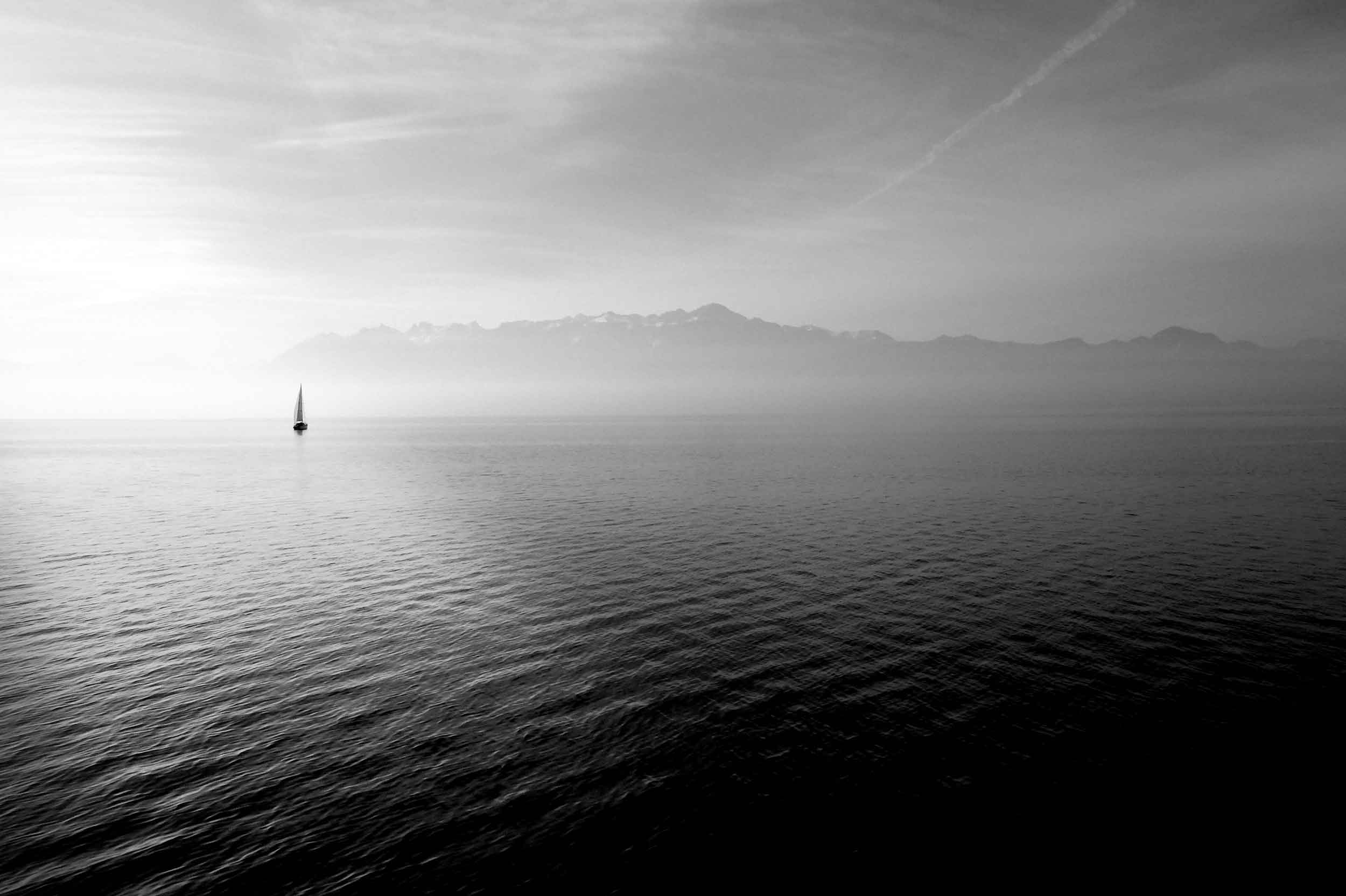
Brought to you by Captain Hook
Sailing comprises wind propulsion of a craft by means of sails and steering it over water, ice or land, depending on the type of craft. A sailor manages the force of the wind on the sails by adjusting their angle with respect to the moving sailing craft and sometimes by adjusting the sail area. The force transmitted from the sails is resisted by forces from the hull, keel, and rudder of a sailing craft, by forces from skate runners for an iceboat, and by forces from wheels for a land sailing craft to allow steering a course on a point of sail with respect to the true wind. (Wikipedia)
web デザインの傾向は、regular clicking から 縦スクロール(vertical scrolling)に代ってきています。
スクロールは、1 ページで全ての web コンテンツが見られるようになります。
誰かが同じ様に他のページにも適していることを発見するまで、この単一のページ技術は、 ソーシャルネットワークで長い間使用されてきました。